Museum Of Ice Cream: Postcard Rebrand
Objective: Redesign a pre-existing ‘thanks for visiting’ postcard for the Museum of Ice Cream within the specified guidelines:
Challenge: Redesign our Thank You card
It’s included in every ecomm order as a thank you from the MOIC team.
Parameters:
Please utilize our signature Pantone 1905C pink
Our primary font is Futura PT but you are welcome to innovate upon that as long as it fits with MOIC aesthetic.
MOIC Aesthetic:
Bright, imaginative (but not childish), sophisticated, & minimal (every graphic element must serve a purpose)
Notes:
The card should be photogenic, inspire creativity and promote connection (either digitally or IRL). Explore different materials and printing processes!
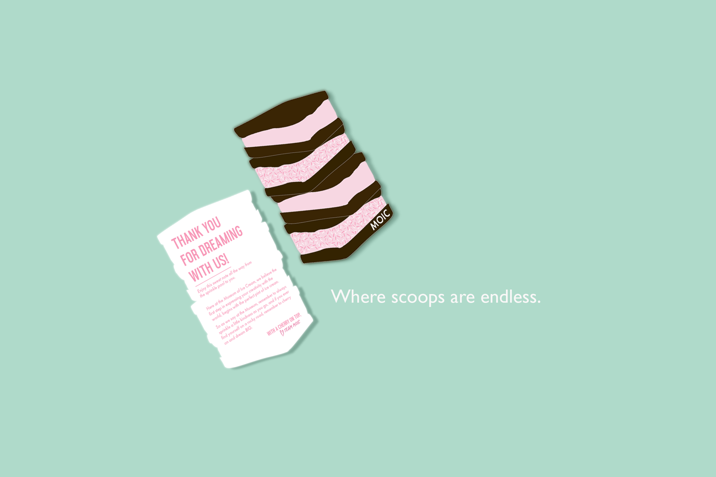
With this redesign I chose to create an option of an illustrated ice cream sandwich that could be featured on the front with a sprinkle border on the opposite side to play off “A Note from the Sprinkle Pool.” Outside of the standard post card size, I created an additional die cut option that could be a fun, more unique option.
Below are the images of before and after.


